
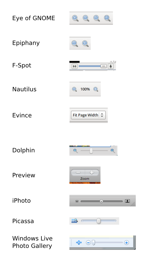
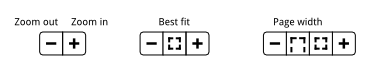
Hi all,

Apologies in advance for the long email. Feel free to skip the analysis
and jump to the second half to see my suggestions...

I've been thinking a bit about zoom controls recently, particularly in
relation to Eye of GNOME. I think we can do better in this area.

There are a few different approaches in GNOME at the moment (I've
attached some examples). Evince uses a combobox. Other apps use a zoom
in and zoom out button, sometimes with a slider (F-Spot), sometimes with
a best fit and 1:1 button (Eye of GNOME), sometimes with a textual
indicator (Nautilus).

These inconsistencies aren't all bad. It would be nice to have *some*
consistency though, or at least a common frame of reference.

So, a few remarks and questions about zoom controls:

* To me, the feedback provided by sliders or percentage indicators (like
those shown in Nautilus and EoG's statusbar) doesn't seem particularly
useful. Generally, a user doesn't need to know if they are zoomed at
150% or if they have zoomed through half of the magnification range.

* Sliders can be fiddly and difficult to use. This is partly because
such sliders are typically horizontal and partly because their effects
can be a bit wild and disorientating. Zoom ranges tend to be large,
sliders short.

* The icons used for zooming are a bit problematic. Each of them
features a magnifying glass containing either a + or a - or a 1 or a
kind of box (for best fit). Though the magnifying glass does a good job
in saying 'these are zoom controls', it introduces unnecessary
repetition when you have two or three zoom icons next to each other.
There's too much noise and the magnifying glass reduces the presence of
the + or - or whatever.

* Best fit and normal zoom buttons should give feedback - they should
appear depressed when zoom is at their level.

* The relationship between normal zoom and 1:1 zoom seems a bit fuzzy.
In EoG, 1:1 is described as 'Normal Size'. Nautilus also has 'Normal
Size', but it is something quite different. The icon for normal size is
called 'zoom-original' but would seem to convey the notion of 1:1,
rather than the notion of 'Normal Size' used by Nautilus.

I'm sure I'm quite wrong about a lot of this and look forward to being
corrected by those who know better. ;) In the mean time, I have a few
suggestions based on my most likely flawed analysis:

* Apps should use a standard set (and arrangement) of buttons.

* Icons should be simple, symbolic, and avoid repetition.

* Avoid the idea/word 'Normal', since this could be confusing (different
people will have different ideas of what normal is). Instead, use Best
Fit and some notion of 1:1 when it is needed (maybe '1:1 Zoom'?).
Typically, Best Fit will be the default view.

I've attached a very basic mockup to show what I mean. The idea is that
apps should (usually, not always) use a variation on the theme
suggested.

Allan
--
IRC: aday on irc.gnome.org
Blog: http://afaikblog.wordpress.com/
Attachment:
Examples.png
Description: PNG image
Attachment:
Mockup.png
Description: PNG image