Re: [Usability] question about scrollbars in cheese
- From: Calum Benson <Calum Benson Sun COM>
- To: "daniel g. siegel" <dgsiegel gmail com>
- Cc: "usability gnome org" <usability gnome org>, Patryk Zawadzki <patrys pld-linux org>
- Subject: Re: [Usability] question about scrollbars in cheese
- Date: Mon, 11 Aug 2008 23:46:29 +0100
On 11 Aug 2008, at 20:40, daniel g. siegel wrote:
see screen1.jpg, there is much place left (where the red marked box
is).
if there are enough items in it, scrolling gets activated and it looks
like screen2.jpg (please ignore the other red marks and duplicate
arrows).

now, is it better to show the scrollbar always or to live with the
space?
Well, those screenshots don't really offer a fair comparison, because
they doesn't show what the scrollbar would show if there was only
thumbnail :) (From the behaviour of other apps, though, I'd assume it
shows the scrollbar shaft taking up the full width of the scrollbar...?)
Personally I prefer to see the empty space than an "unscrollable"
scrollbar-- it gives you immediate feedback that you're seeing
everything that there is to see. In an ideal world, perhaps the
visual appearance of a "full" scrollbar would be less intrusive than
it is today[1]-- maybe something to think about for gtk 3.0 :)
(As an aside, I'm slightly confused as to why you still have left and
right buttons either side of the thumbnail view, in addition to those
in the scrollbar? That sends rather mixed messages to the user,
perhaps suggesting that they would do different things.,,)
Cheeri,
Calum.
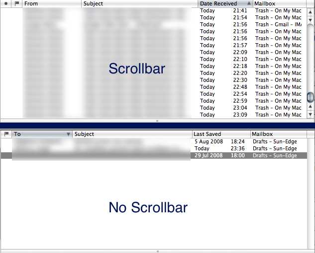
[1] E.g. see attached screenshot from Apple Mail, albeit for a
vertical scrollbar--the trough is always shown, so you don't get
content jumping around as the bar appears/disappears, but the buttons
and shaft are gone so it has far less visual weight than a "full"
scrollbar.
--
CALUM BENSON, Usability Engineer       Sun Microsystems Ireland
mailto:calum benson sun com            GNOME Desktop Team
http://blogs.sun.com/calum             +353 1 819 9771

Any opinions are personal and not necessarily those of Sun Microsystems
[
Date Prev][
Date Next] [
Thread Prev][
Thread Next]
[
Thread Index]
[
Date Index]
[
Author Index]
