=?UTF-8?Q?Re:_All_GNOME_Shell_Developers.=0A?=
- From: hills <hills tlen pl>
- To: gnome-shell-list gnome org
- Subject: Re: All GNOME Shell Developers.
- Date: Sat, 19 Dec 2009 01:54:10 +0100
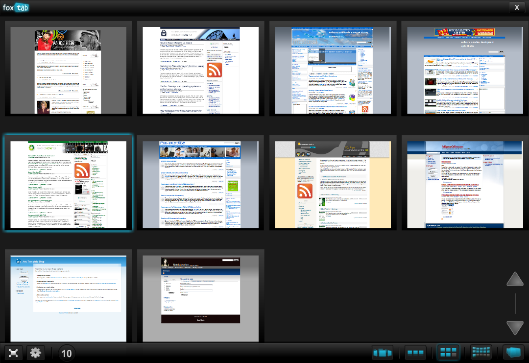
"Getting out of your car to change the radio station" analogy makes some sense. Zoom out effect is distracting and aimless when user use only one workspace. My previous message [1] take some approach to remove left side panel so zoom out will be unnecessary. All non-running applications and non-open documents can be presented in a similar way to running applications so far. Look at this sample screenshoots for better idea what I mean:

* FoxTab: http://www.maxiorel.com/files/images/2009/04April/838/foxtab-3.png
* Colliris: http://getdebpersian.files.wordpress.com/2009/05/cooliris11.jpg
* Google Chrome: http://www.tech-mania.com/wp-content/uploads/2009/09/chrome-3-tab.JPG
* Moblin: http://www.netbooknews.it/wp-content/uploads/2009/10/netbooknews-it-ubuntu-moblin-dell-media.png

I really like the idea of browsing my applications, documents and places in full-screen. There will be enough space to show big thumbnail and metadata. The bigger the better :-) (Fitts's law).


[1] http://mail.gnome.org/archives/gnome-shell-list/2009-December/msg00082.html
[
Date Prev][
Date Next] [
Thread Prev][
Thread Next]
[
Thread Index]
[
Date Index]
[
Author Index]
