
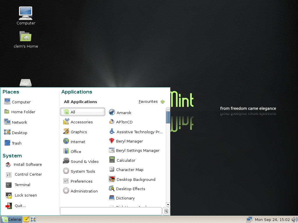
Il giorno mer, 10/10/2007 alle 12.43 -0500, Benjamin Gramlich ha
scritto:
> > Do you mean the one pictured <http://linuxmint.com/pictures/screenshots/celena/mintmenu.png>?
>
> Yeah, that's the one. Sorry I wasn't more clear and didn't attach a link
> to a picture. It's not a drop-in replacement for the current gnome-menu,
> but it has some excellent features:
>
> 1) The search field
> 2) You can mouse over Submenus to pull up the menuItems
> 3) It's pretty
> 4) The favourites menu
>
> It's written in python right now, and it's a little unresponsive at
> times when other programs are running.

I can't say I like the way this menu is structured a lot. I think that
having to watch a wider area when looking for applications and other
things introduces more complexity and confuses the user. Taking some
more horizontal space in the panel as it is done now with the
Application/Resource/System menu is very friendly and quick.

> this is the coolest thing about the mintMenu: it takes up a static
> amount of space, both horizontally and vertically. if the submenu that
> you mouseover is taller than the window for the menu then the submenu
> becomes a scrolling window. This way the users eyes can stay within a
> confined area to search for what one needs. I think it's easier to
> search for things horizontally than it is to search vertically, but
> maybe that's me and not a fact.

Also the idea of scrolling the menu area isn't very welcomed in my
opinion. Windows 98 did that, and it was changed in XP (sorry in case I
misunderstood what Benjamin said). It makes it harder to find
applications for the user that has to scroll a window / to wait for a
window to scroll.

This menu reminds me a lot of WinXP start menu (okay, okay: I know it's
a lot better, but is more crowded than necessary in my opinion). I
always spent a lot of time looking for buttons in the start root menu in
Windows -- for example locating the Resources item, or the Network
connections one. I always wasted a couple of seconds to re-orient me. I
remember it was one of the things I was *relieved* wasn't mimicked in
GNOME/KDE when I finally switched to GNU/Linux.

There is also a usability study that discuss the differences between
Applications/KMenu/Start menu. See in particular the "GOMS analysis of a
typical use case", "Flexibility and efficiency of use" and "Visual
hierarchy is clear" paragraphs.

http://obso1337.org/hci/papers/Study_of_Desktop_Start_Menu_System_Usability.pdf

The study also says that a good menu would need a way to search for its
content by keyboard. That could be something we could port (don't know
the best way to fit it in the UI) from the Deskbar applet to the
Applications menu.

>
> Also, since the gnome control center seems to be aiming to incorporate
> all the Preferences and Administration capplets, we could eventually
> remove these Submenus from the gnome-menu and have just the control
> center available. [...]

This could make sense since they're not so-frequently used as
application menu items, and they tend to be quite a lot.

I'd prefer seeing less items (e.g. Appearance groups three different old
items) directly in the menu than a separate window for tons of applets,
though. It enables for faster access to things, which is what we should
care more about.

>
> Ciao,
> benjamin
>

Just my 2c,
--
Matteo Settenvini
FSF Associated Member
Email : matteo member fsf org


-----BEGIN GEEK CODE BLOCK-----
Version: 3.12
GCS d--(-) s+:- a-- C++ UL+++
P?>++ L+++>$ E+>+++ W+++ N++ o?
w--- O- M++ PS++ PE- Y+>++
PGP+++ t+ 5 X- R tv-- b+++ DI+
D++ G++ e h+ r-- y?
------END GEEK CODE BLOCK------
Attachment:
signature.asc
Description: Questa =?ISO-8859-1?Q?=E8?= una parte del messaggio firmata digitalmente