
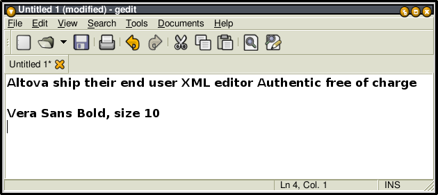
At 120dpi, and font size 10, I observe the problem noted in the attached
screenshot with Bitstream Vera Sans Bold.  The weight of glyphs with
diagonal straight lines is much lighter than other glyphs.

I'm using Debian sid, libfreetype6 2.1.3-9.  Fontconfig is set to use
"best shapes"

thanks

-- Edd Dumbill
Attachment:
Screenshot-Gedit.png
Description: PNG image
Attachment:
signature.asc
Description: This is a digitally signed message part