
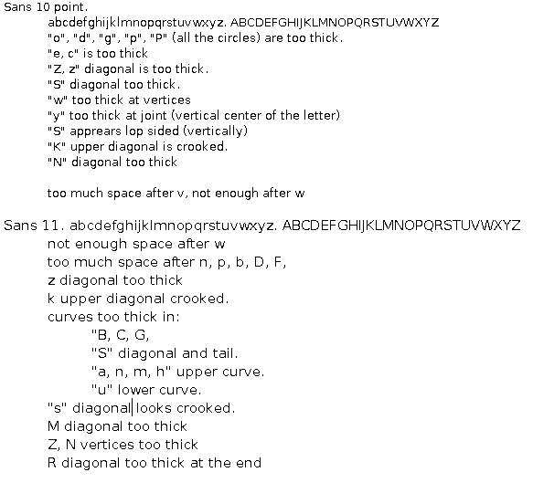
The following is a critique of Sans at 10 and 11 points. The font renderer is
Windows 2000 non-anti-aliased, in wordpad. The point size does not always
correspond from system to system, so I've included a GIF (numeral "1" is 9
pixels high at 10 point and 11 pixels high at 11 point).

Sans 10 point.
	abcdefghijklmnopqrstuvwxyz. ABCDEFGHIJKLMNOPQRSTUVWXYZ
	"o", "d", "g", "p", "P" (all the circles) are too thick.
	"e, c" is too thick
	"Z, z" diagonal is too thick.
	"S" diagonal too thick.
	"w" too thick at vertices
	"y" too thick at joint (vertical center of the letter)
	"S" apprears lop sided (vertically)
	"K" upper diagonal is crooked.
	"N" diagonal too thick

	too much space after v, not enough after w

Sans 11. abcdefghijklmnopqrstuvwxyz.
ABCDEFGHIJKLMNOPQRSTUVWXYZ
	not enough space after w
	too much space after n, p, b, D, F,
	z diagonal too thick
	k upper diagonal crooked.
	curves too thick in:
		"B, C, G,
		"S" diagonal and tail.
		"a, n, m, h" upper curve.
		"u" lower curve.
	"s" diagonal looks crooked.
	M diagonal too thick, asymmetric
	Z, N vertices too thick
	R diagonal too thick at the end

Hope this helps.

Thanks
Moh
Attachment:
sans10-11.gif
Description: GIF image