Re: 2.3 Feature Request: Inactive toolbar icons
- From: Bill Haneman <bill haneman sun com>
- To: desktop-devel-list gnome org
- Subject: Re: 2.3 Feature Request: Inactive toolbar icons
- Date: 11 Feb 2003 18:00:39 +0000
...
> The same example at 25% visability is at=20
>
> http://www.cs.hmc.edu/~ben/pix/insensitive3.png
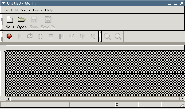
At 25% we're really getting hard to see, the accessibility impact is IMO
too great. At 50% it's probably OK since one doesn't expect
particularly good visibility for insensitive items.
Can someone post a screenshot using 50% and the HighContrastInverse or
HighContrast theme?
thanks,
- a very busy Bill
> --Ben
...
>
> Calum Benson wrote:
>
> >This won't work for people who need High or Low Contrast themes,
> >though,so until we have an engine that handles those in a different way
> >(e.g.by retaining some variation of the checkerboard pattern) we
> >shouldn'treally make this kind of behaviour the default, I don't
> >think.Cheeri,Calum.
>
> With the high-contrast theme is impossible to distinguish inactive icons
> from the active ones.
--
Bill Haneman <bill haneman sun com>
[
Date Prev][
Date Next] [
Thread Prev][
Thread Next]
[
Thread Index]
[
Date Index]
[
Author Index]
