
So as I mentioned in the previous email, I'm entertaining a UI switch
up. Using the new control center panel system instead of an app that
the user launches. Having the preferences be front and center will
bring more focus on automatically backing up (rather than launching
the app to manually back up) and make things seem more integrated.
First, this would probably involve de-emphasizing the admittedly
confusing name Deja Dup and have the panel be called "Backup" or
"Backup Settings" so it looks like preferences for the OS instead of a
particular app.
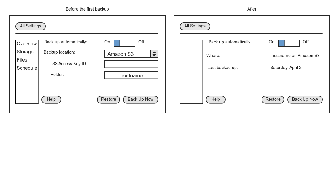
Second, I've made some mockups for how this might look (attached).
Four categories on a list on the left ("Overview", and the three
current tabs from the preferences). The overview is the only new
part.
Before the first backup or restore, it would show the two most
important settings: where to backup and whether to automatically
backup. After that, it would show a few labels about where and when
the last backup happened.
At the bottom are buttons to do what the main UI does now: help,
manual restore, manual back up.
This ends up looking a bit like Time Machine.
What do ya'll think? Allan Day, as the resident usability guy, any thoughts?
-mt
Attachment:
1. Panel1.png
Description: PNG image