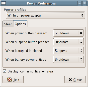
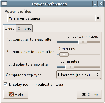
[Utopia] Gnome Power Manager, updated screenshots
- From: Richard Hughes <hughsient gmail com>
- To: Gnome Power <gnome-power-devel lists sourceforge net>, Utopia <utopia-list gnome org>
- Cc:
- Subject: [Utopia] Gnome Power Manager, updated screenshots
- Date: Mon, 25 Apr 2005 20:26:34 +0100
I've digested most of your comments and come up with the attached - not
in CVS - just for me playing around.

Comments of mine:
* The combo box at the top is only present with battery hardware.
 (combo is needed to avoid having a huge duplication in UI)
* Batteries (laptop, mice, etc) when low always give warnings.
* Only one icon is displayed, optionally, except when devices (e.g.
mice) are low, when multiple icons are shown.
* Suspend options are now suffixed with (to disk) and (to RAM)
* "Mains" (apparently a UK thing...) has been replaced with "power
adapter"
* There are LOTS less options - to keep things simple.
* GNOME prefix removed.
* Buttons that you don't have (e.g. suspend) don't show
* Lid "button" clarified.
* The "useful" (not) tooltips have disappeared.
* The removal of the helper icons have made everything minimal - have I
gone too far here?
* Tooltips are now multiline and minimally display all devices.

Please, comments. When I'm happy with the UI I'll start working on the
real "guts" of G-P-M, and it'll start doing interesting things.

Thanks, Richard.


[
Date Prev][
Date Next] [
Thread Prev][
Thread Next]
[
Thread Index]
[
Date Index]
[
Author Index]